art museum app design

UX Research, Prototyping, UI Design
design challenge
Create an app for a public art museum to advertise exhibitions and events, provide museum information to patrons, and enable patrons to schedule visits.
project overview
This was a personal project I worked on to understand the fundamentals of UI/UX design. I conducted user research, developed user personas and a user journey map, sketched wireframes, and constructed low and high fidelity prototypes for this mock app. These prototypes were also tested and iterated upon to produce a final functional product.

define and empathize

I chose this design prompt because of my own interest in art and hobby as a museum-goer. Thus, much of my research was qualitative, not quantitative, and came from personal experience, interviewing friends, and online reviews left by patrons on museum websites. In conducting my research, I wanted to answer the following questions:

  • Why do people visit art museums?
  • What are the challenges associated with visiting an art museum?
  • How can the process of visiting an art museum be improved?

To answer these questions, I first had to learn about what kind of users would use such an app, identify the journey these users would take, and empathize with the user to create an ideal experience for them. To achieve this, I came up with user personas, developed a user journey map, and conducted a competitive audit of similar existing applications.

understanding the user

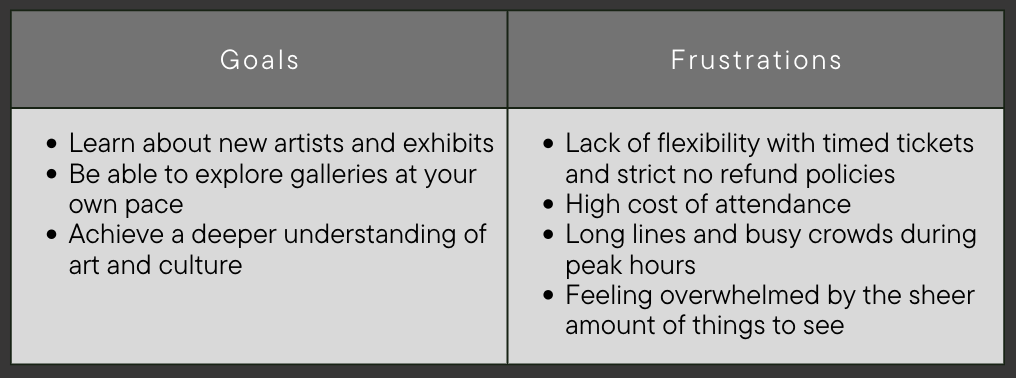
I casually interviewed friends and family and also drew upon my own experiences visiting museums to gain a deeper understanding of the target user base. I was able to generate two user personas with the information I collected— a casual museum-goer and an art enthusiast. These two personas covered the majority of the kinds of users that would engage with an art museum app and I was able to identify key goals and frustrations for my target user base.

Some users wanted the freedom to explore entirely on their own, while others felt overwhelmed by the volume of possibilities and sought a more guided and structured experience. Users were also frustrated at the high cost and lack of flexibility associated with buying tickets, especially when they had to endure a busy and crowded visit.

Competitive Audit

I also observed the experience of other museum apps and websites to understand what they were doing well and where I could incorporate improvements to the existing experience. Some of my findings were consistent with user frustrations, such as strict refund policies and high ticket prices. I also noticed that none of the competitors I looked at factored in the user experience while visiting their museum; they all focused on servicing a user either before (exhibit information and ticketing) or after (membership and donation advertisements) a visit.

The User Journey

This user journey map showcases a user's path through the process of visiting an art museum, along with associated emotions and potential pain points. Using this journey, I identified possible features and improvements that would make for an optimal user experience along every step of the way.

prototype
I developed lo-fi wireframes that modeled the app's desired layout and then a hi-fi prototype that incorporated color, text, and design elements. However, it does lack photos and still contains filler text.
test and iterate
I shared this initial design with friends and family and received feedback on potential improvements. In the time since I built this, I've also grown immensely as a designer and can see that I lost sight of the app my research suggested and focused too much on building an app that matched the existing vision in my head. I'm currently working on a revised design that incorporates both tester feedback and revisiting the research to fill the gap between what users want and what I designed.

user feedback

The main criticism was that a lot of language was unclear. Testers did not understand the perks of membership vs a single-day pass and it was difficult to distinguish information in text-heavy screens. However, testers liked the use of color, finding it "not too distracting" and the information architecture was easy to navigate.

revisions to incorporate

To redirect focus to the user, I want to incorporate more personalization, in the form of a "recommended for you" section. I also want to add features that will engage the user during their visit. This will include guided tours, an interactive map, and a QR code scanner. In terms of visual design, I'd like to incorporate a more dynamic color palette, with better use of hierarchy and surfaces, as well as use more iconography in place of heavy text.
final product
in progress. to be shared when complete.